
- Brand Guidelines -
Introduction :
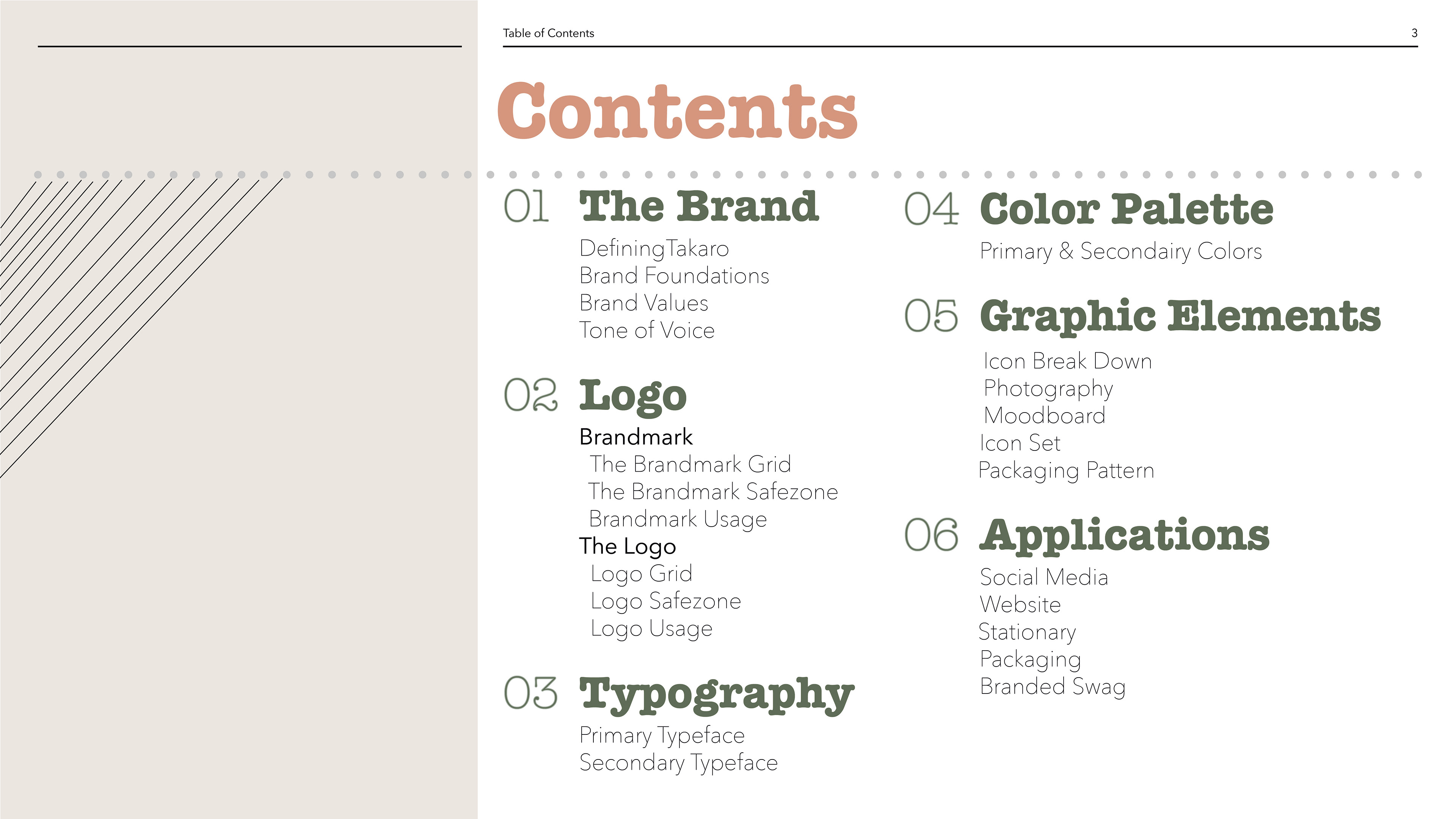
The Brand :
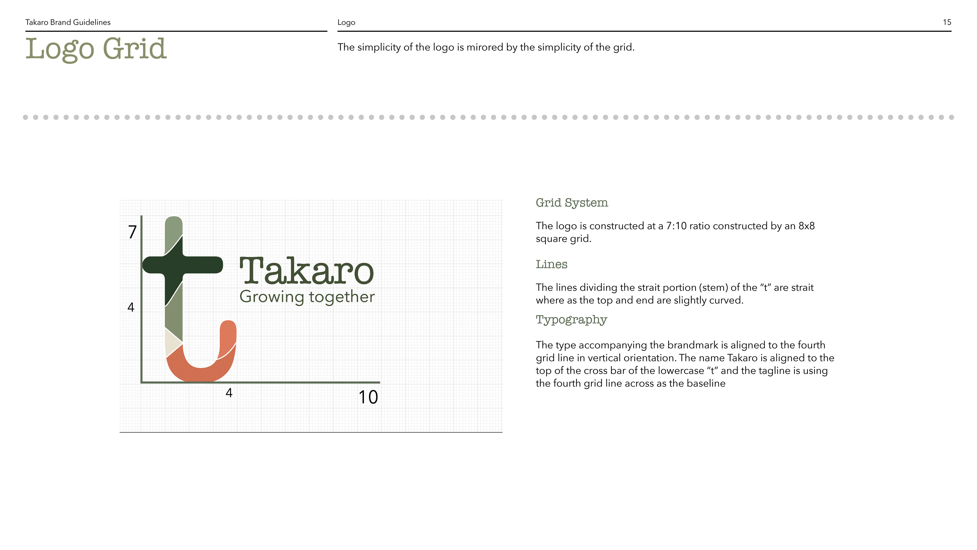
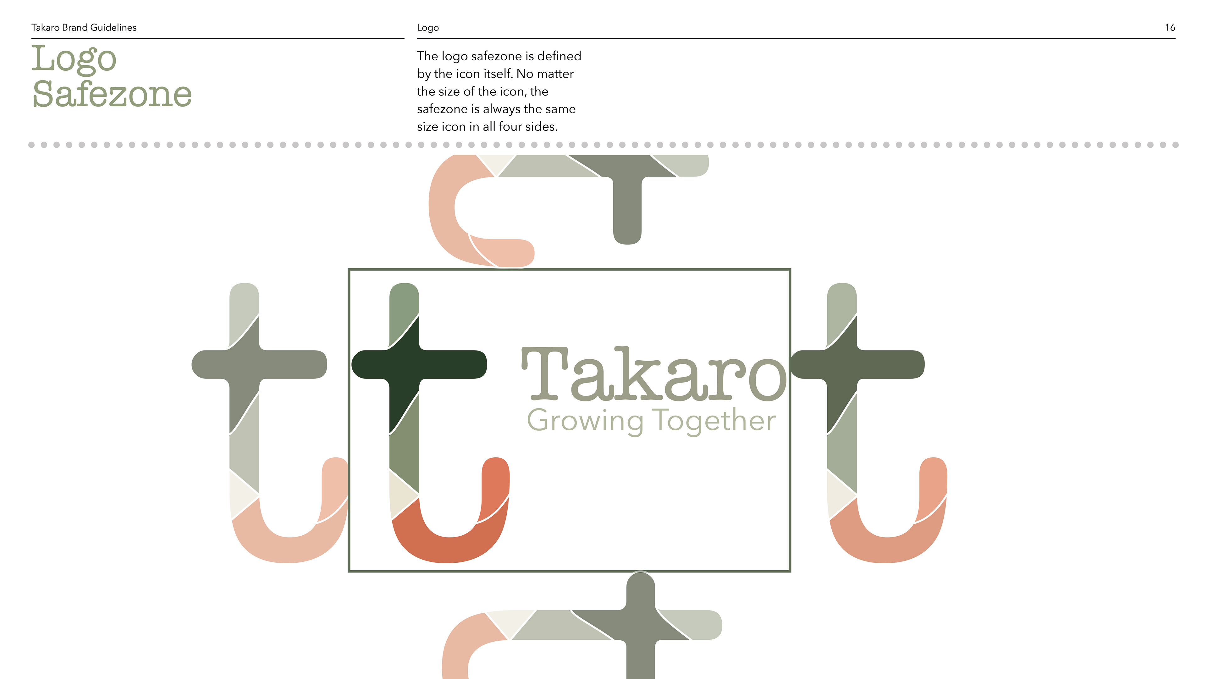
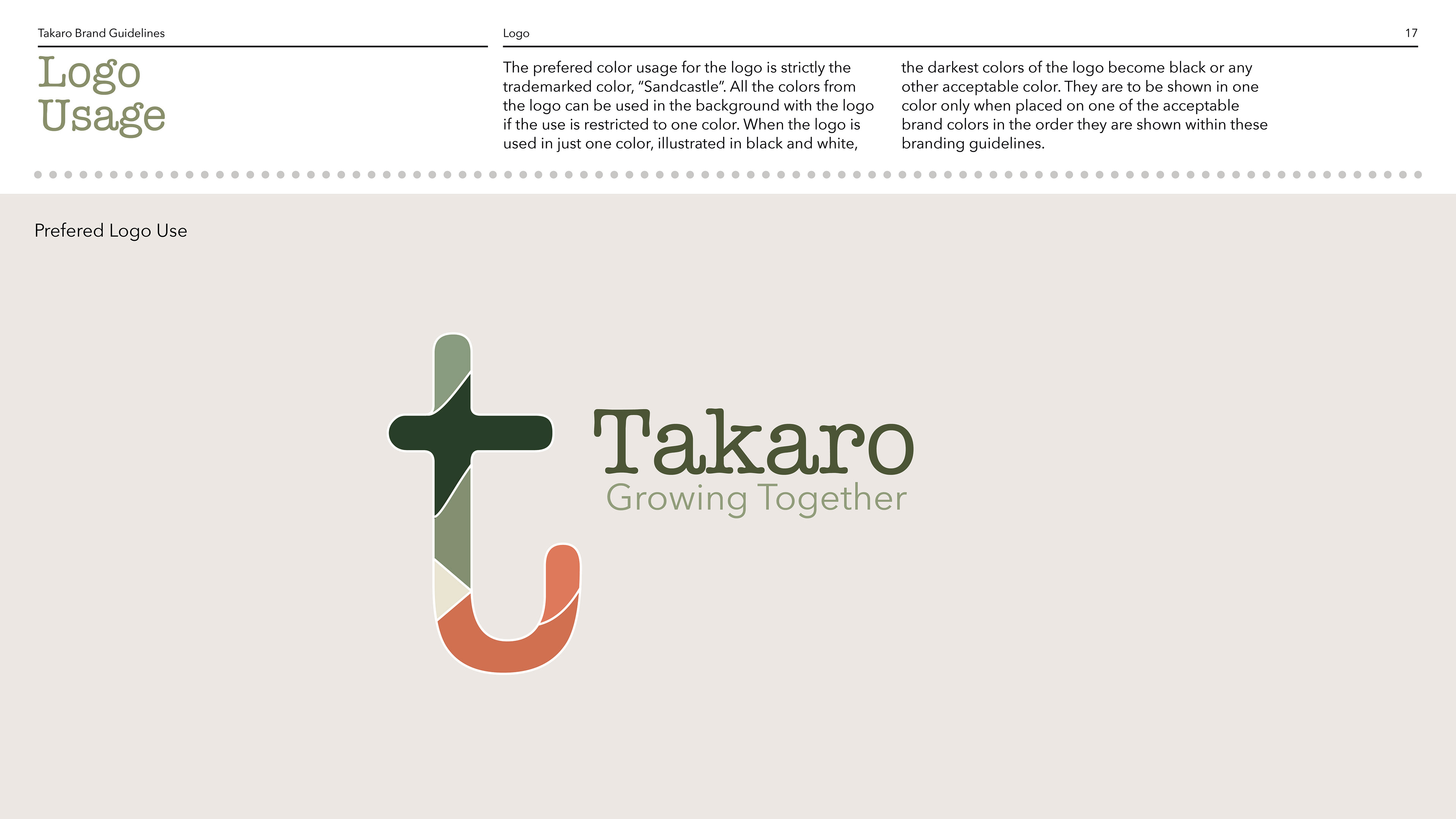
The Logo :

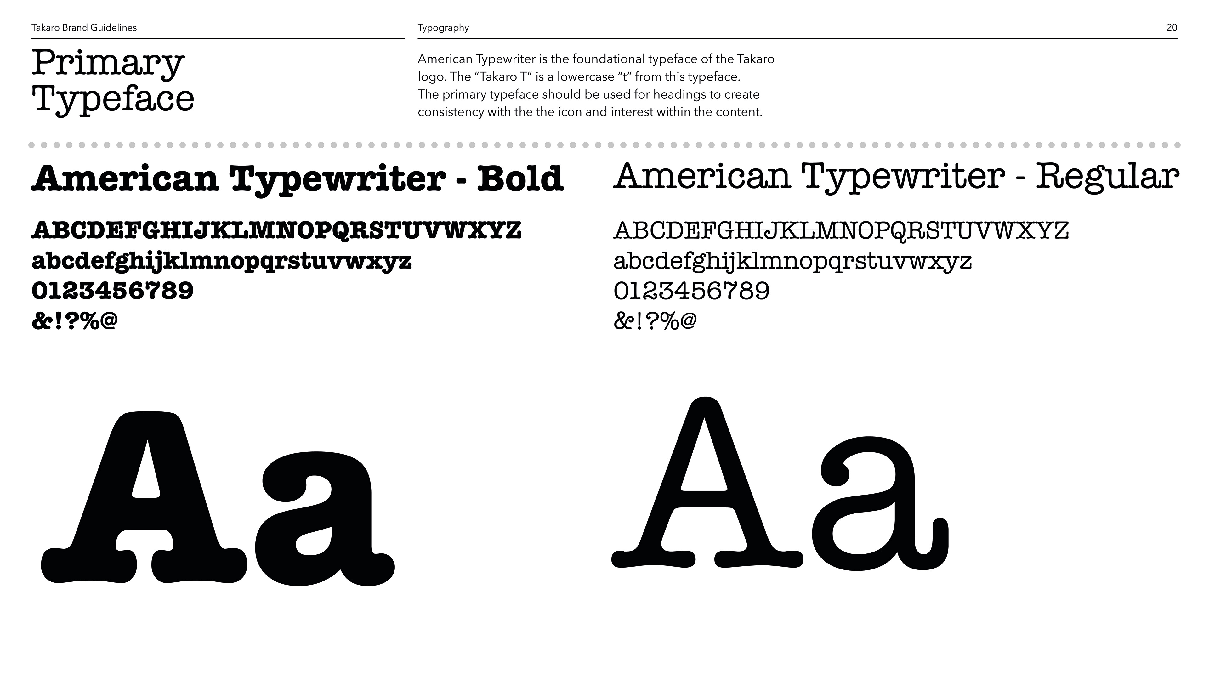
Typography :

Color :
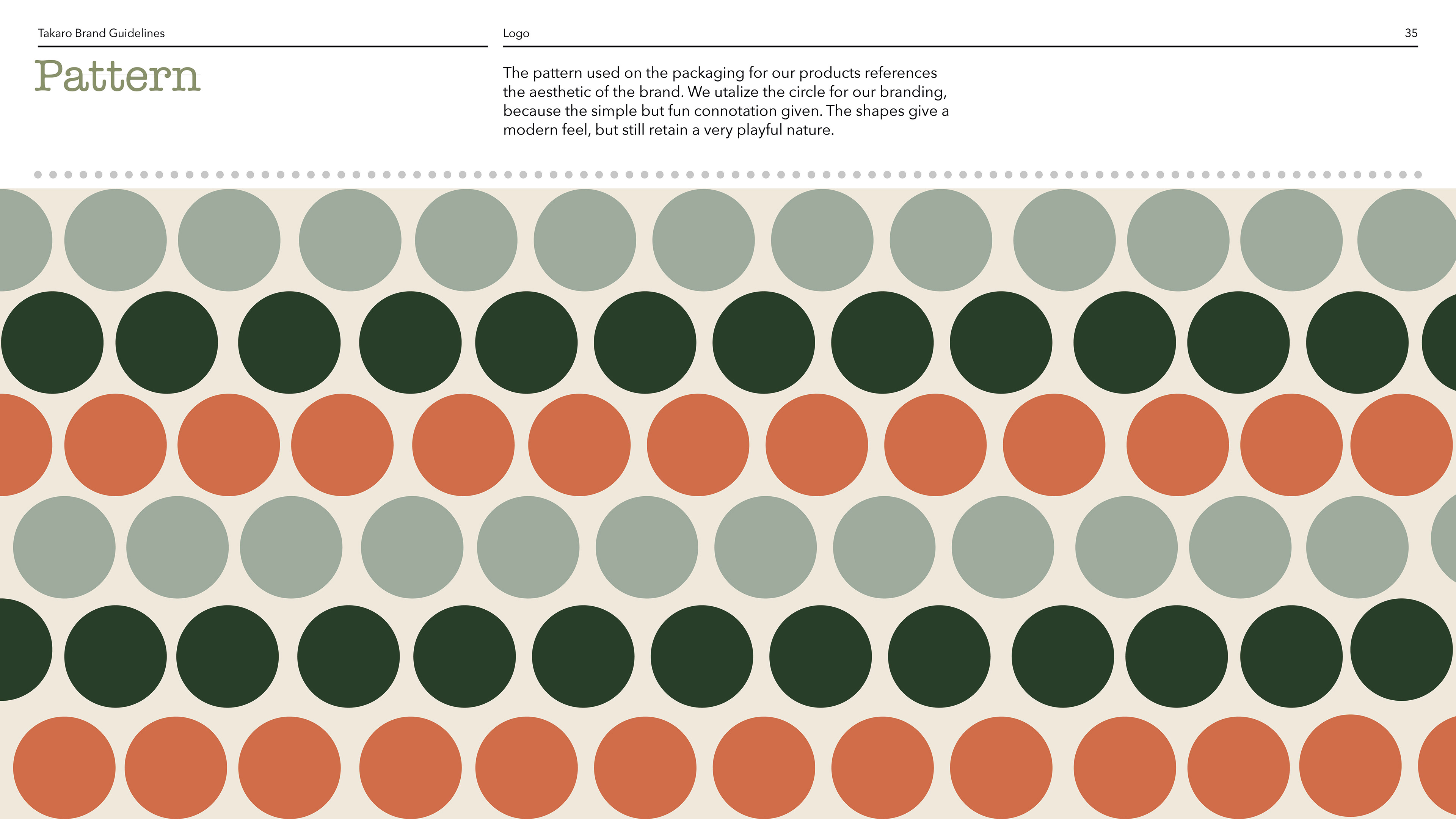
Graphic Elements Guide :

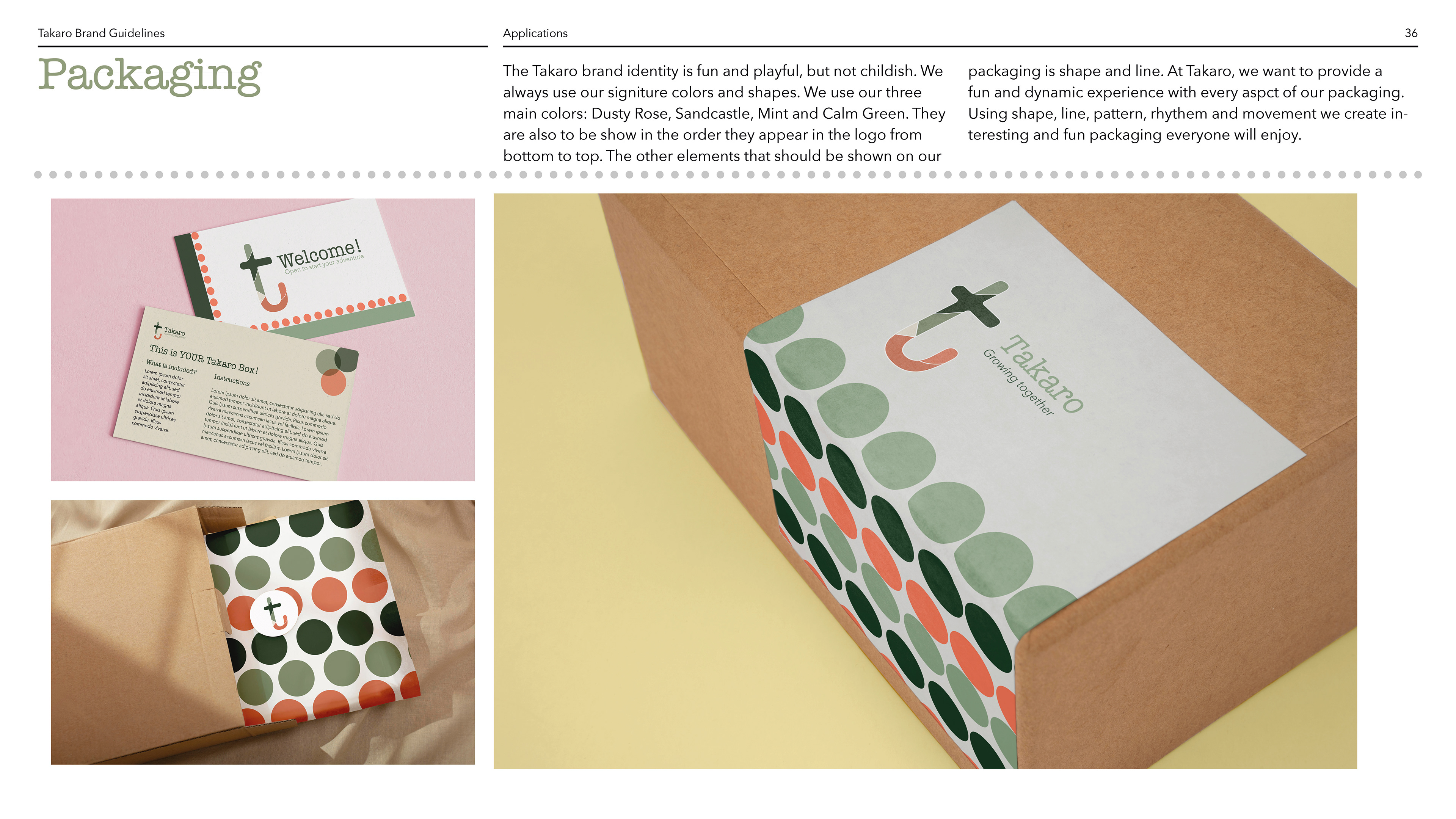
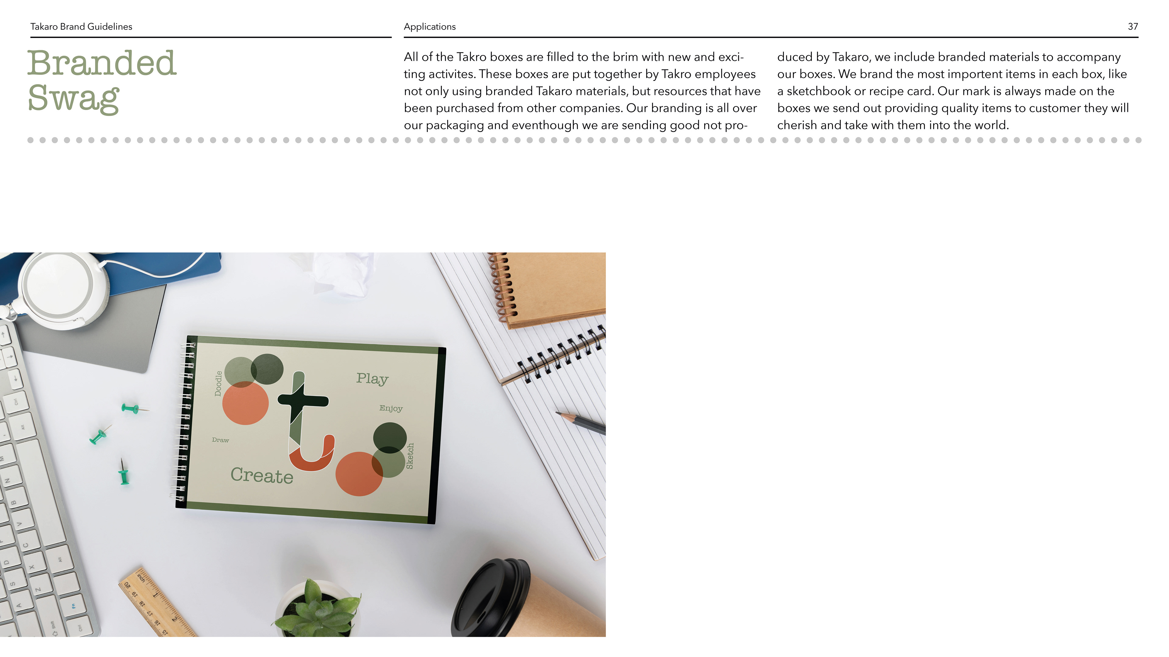
Application Guide :

Takaro Brand Development
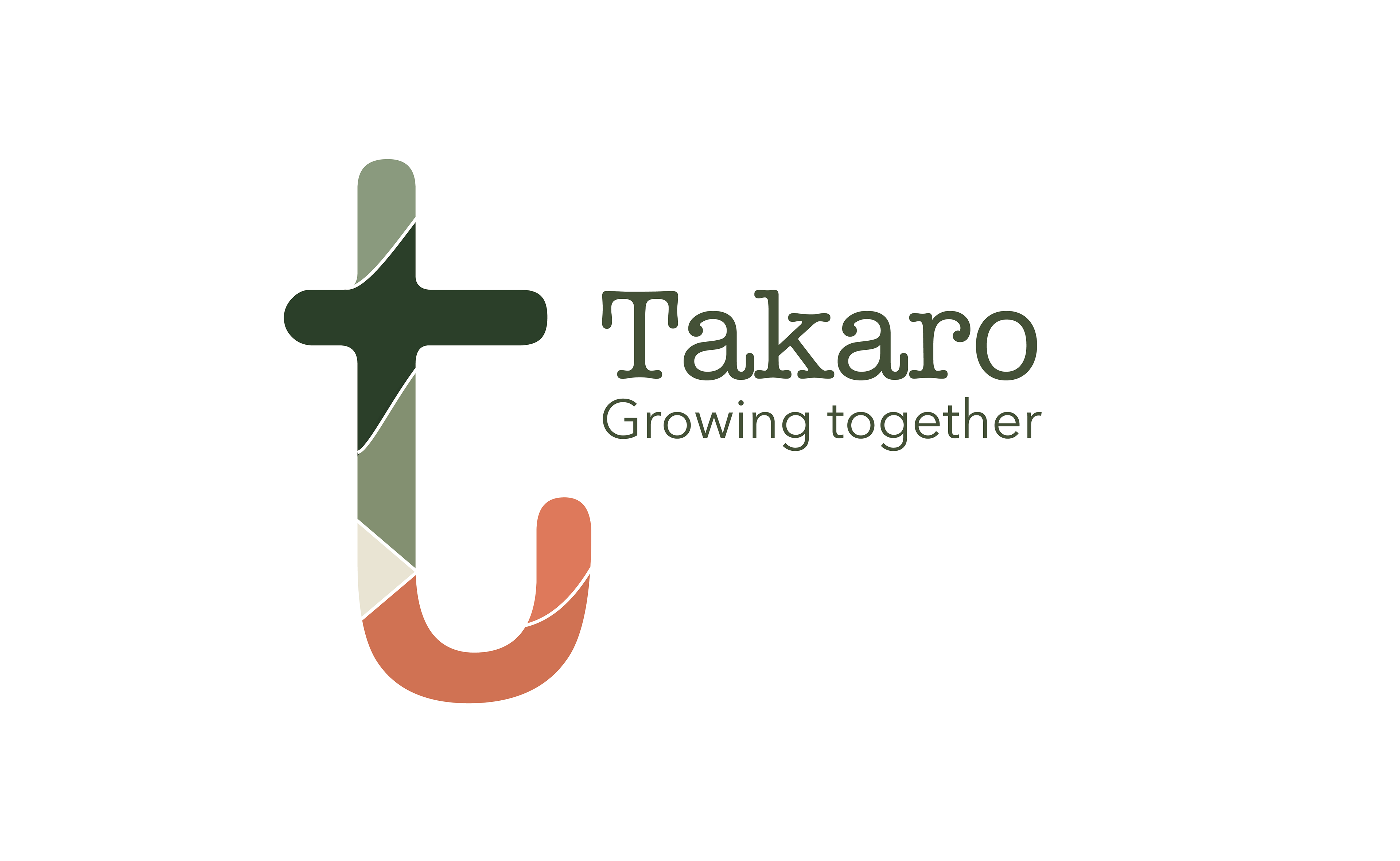
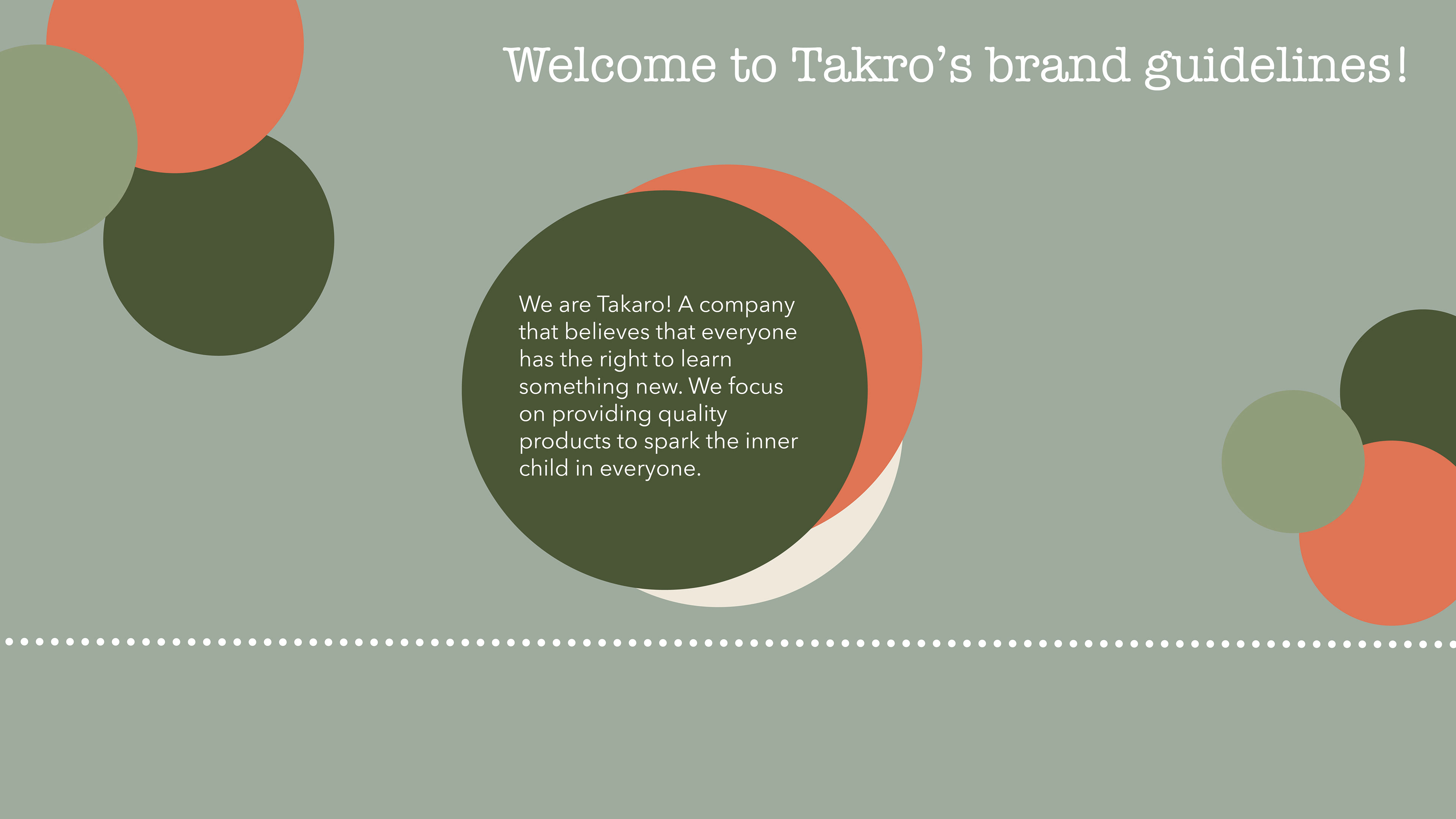
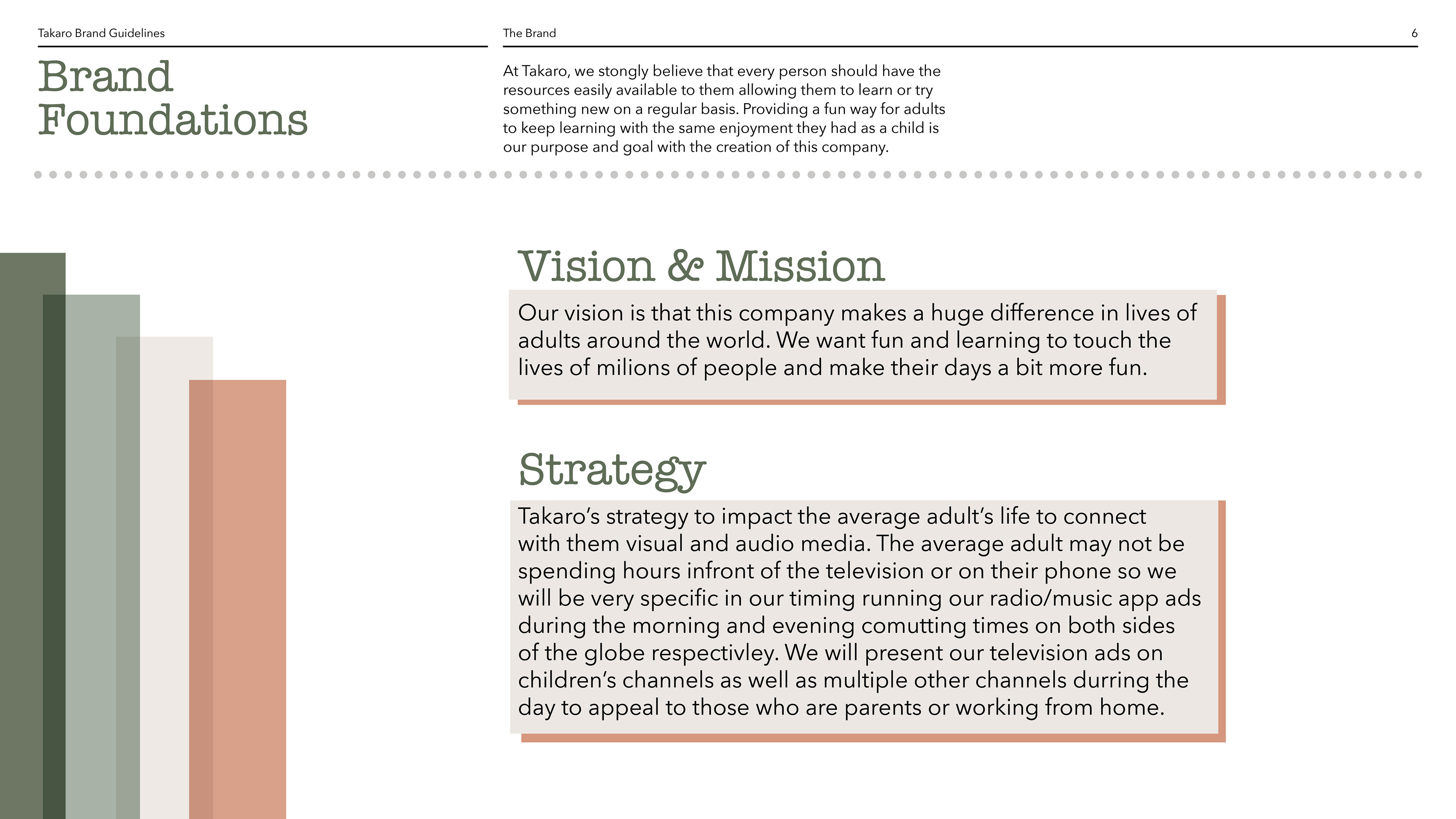
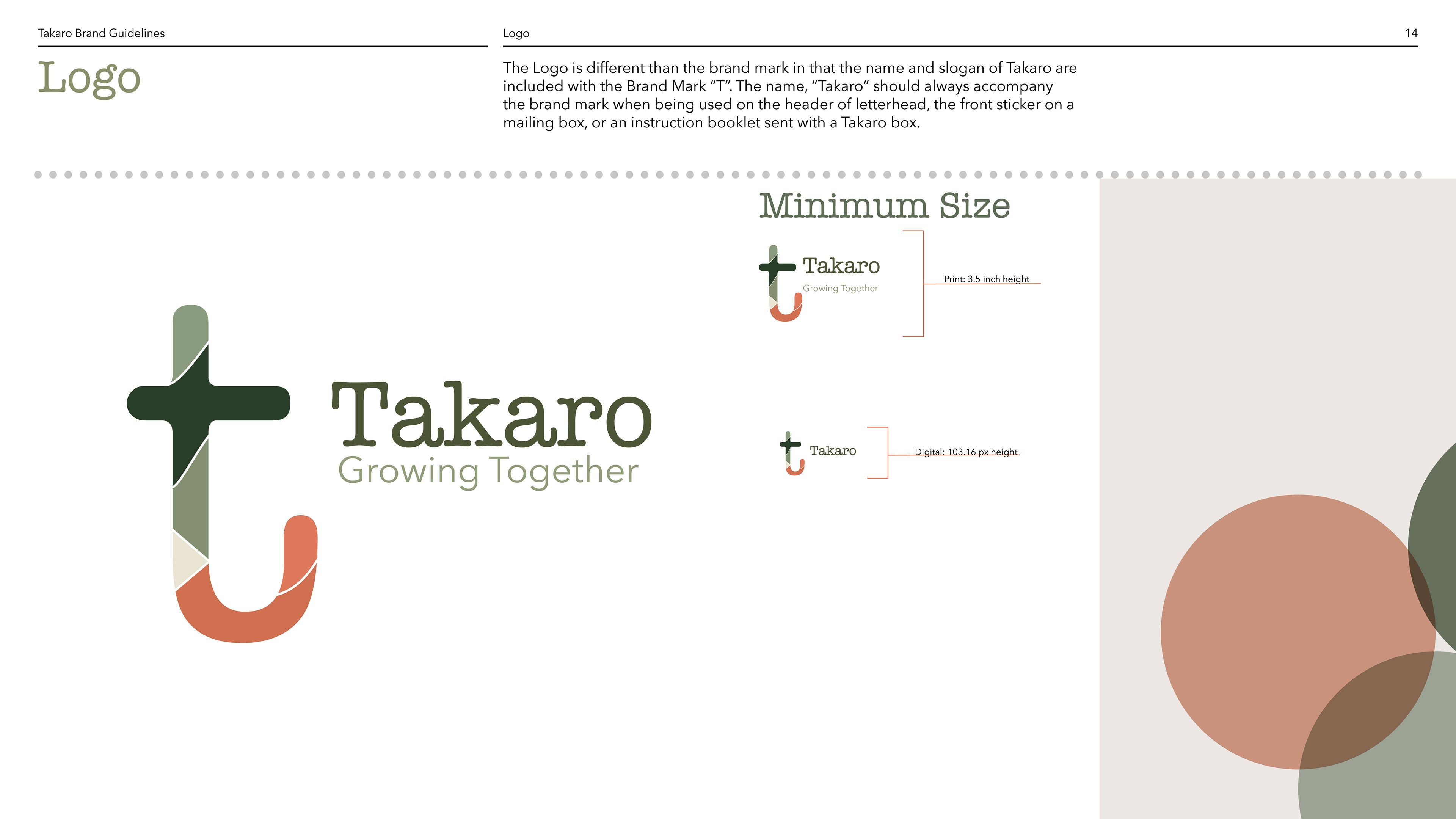
The Takaro brand was created as an endorsed branding project. Fun subscription boxes are not as prevalent in the adult market as they are for children. This lead me to the creation of Takaro whose mission is to spark further development and play for adult consumers. The monthly boxes are filled with STEM projects, recipes, creative exploration ideas, and so much more! The tag line "growing together" represents how we can all strive to grow more everyday. The logo is separated with different colors to represent building blocks symbolizing how we all continue to grow and build upon ourselves every day.
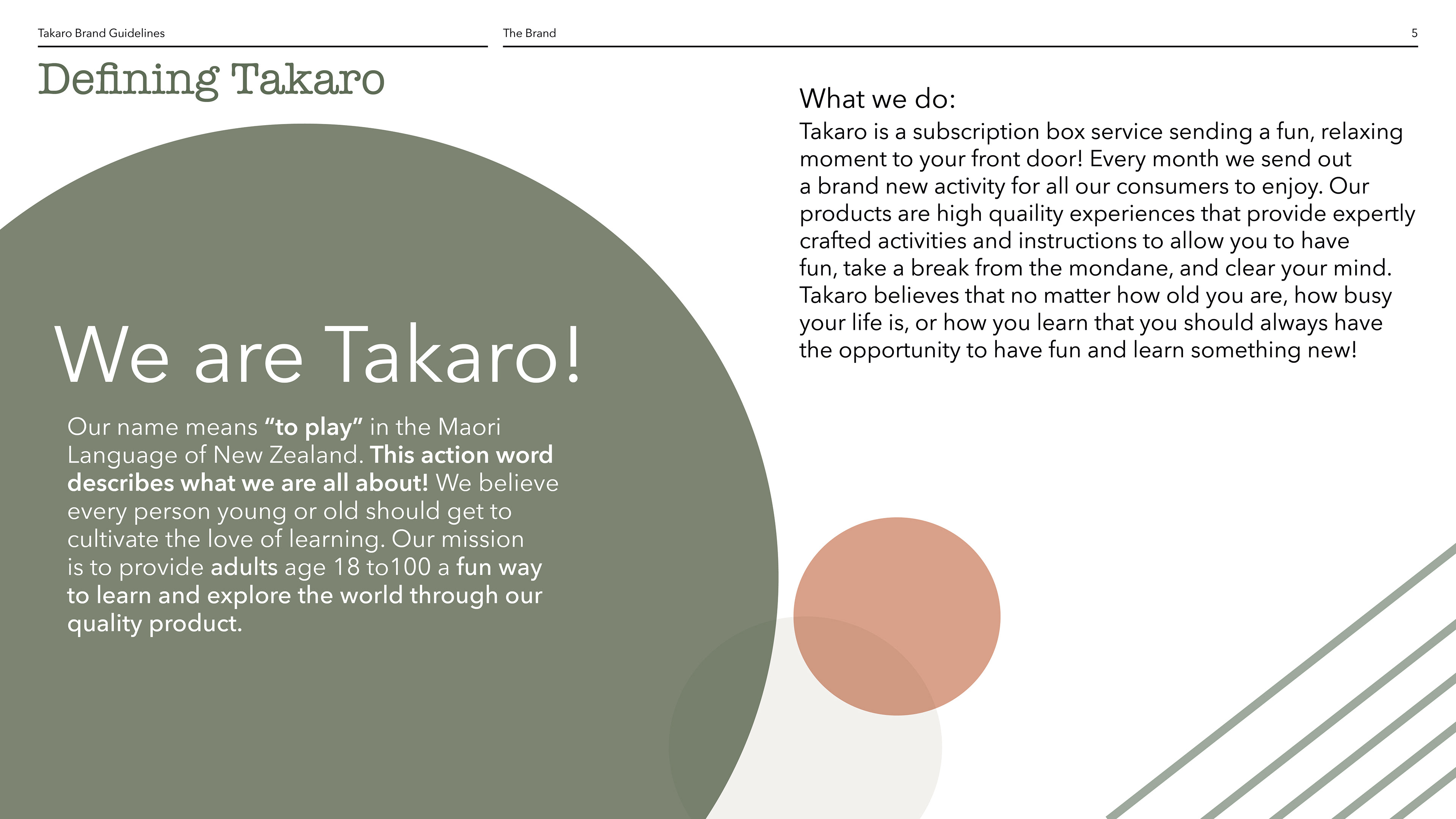
Takaro is a fictional brand I developed as an endorsed brand in this exercise from the developed brand Kiwi Co. Kiwi Co. is a montly educational subscription service for children and their name has ties with the country of New Zealand for that is where the idea for the company was developed. With this project being a branch of the existing company, I drew inspiration for the name from the Māori language which is the native language spoken in New Zealand. In Māori, the work "Takaro" means "to play". I built the connection to New Zealand and the parent brand based in the language spoken and the core concept driving both businesses.